PROBLEM SUMMARY
The Association of Financial Professionals (AFP) launched a Diversity, Equity, and Inclusion (DEI) initiative to address the treasury and finance profession's lack of workforce diversity which can hinder innovation and limit perspectives. This initiative focuses on representing established diverse professionals to a younger diverse audience so they can see themselves reflected in the finance profession. We did this by creating a landing page that introduces users to the DEI initiative and drives these users to AFP's Career Hub page.
The goals of this landing page are to:
• Increase awareness of the treasury and finance professions among underrepresented groups, specifically college students majoring in finance.
• Foster connections between early-career professionals and industry mentors.
• Provide access to educational resources, scholarships, and professional development opportunities.
• Create a more supportive and inclusive community within the treasury and finance field.
• Feature diverse established finance and treasury professionals offering mentorship, guidance, and career tips.
• Drive users to the AFP Career Hub page.
Target Audience
The primary target audience is college students majoring in finance, particularly those from underrepresented groups. Secondary audiences include early-career professionals in the treasury and finance profession, industry mentors, and AFP members.
PAPER WIREFRAMES
Sketched a few wireframes on paper based on the initial content needed on the page. This evolved over time to accommodate more videos, testimonials, glossary, and articles.
ELEMENTS, FONT, AND COLORS
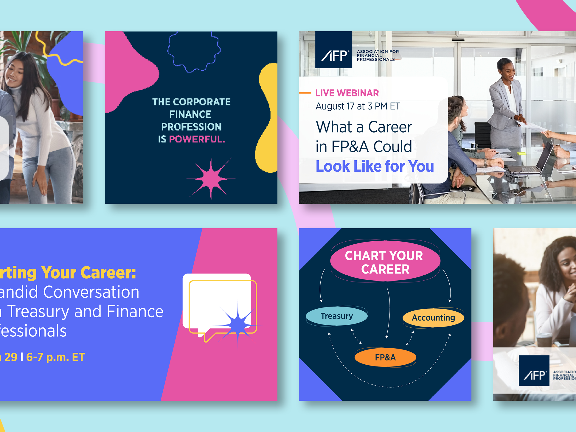
Vibrant color palette and distinct shapes. Wanted a unique look and feel but kept the same AFP dark blue and Gotham Narrow font to tie back to the main AFP Membership brand.
DESIGN ITERATIONS
Main differences between each of these mockups were the color palettes and header/intro text placement. Ultimately decided to go with a more vibrant color palette over the original AFP Membership color palette to give this initiative a distinct look and feel. Set the header image to rotate between four photos to add more variety and movement. Wanted to keep the emphasis on imagery and sponsor logo, moving the CTA further down the page.
FINAL DESIGN
